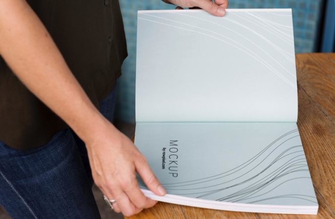
Ah, media kits. It seems like nowadays, anybody with a following of any capacity on a social media platform has created a media kit. But what exactly goes into creating a media kit? What are the do’s and don’ts? And why should you make one?
A media kit, unlike a style guide, is the gist of who you are and what you represent in a nutshell. Unconditional journalists, like bloggers and YouTubers, would have a media kit that’s one page long. Someone with a more extensive career and larger business may have a media kit that spans a couple pages. But always aim on the shorter side for a media kit.
The reason why is simple — when you pitch your brand to journalists, they need to know who you are and what your brand stands for in a split second. A media kit allows them to do that. Research and fact-checking is integral in the journalism field, but journalists do not have time to waste researching a potential pitch without knowing if it will be useful or not. Make it easy for them, and have all your information in one place, preferable, on one sheet, from the get-go.
So what should you put in your media kit? Obviously, your name, your company’s name, and how long you’ve been around. Additionally, listing any valuable partnerships, brand endorsements, statistics, awards, and any other relevant tidbits of information displayed in the best light possible would be smart to include in your media kit. A couple small, meaningful photographs belonging to a cohesive aesthetic would look appealing on paper as well.
While there are do’s and dont’s to media kits, your media kit should scream “you.” A journalist can tell if you dragged-and-dropped your photos and words into a generic media kit template. Create a template using the color scheme of your business and have at it — making it look as original and professional as possible.
For more pointers on creating and building your media kit and a customizable template (to make it easy!), check out the PressReady Create your Media Kit Workbook!
Read as published on PressReady.io


